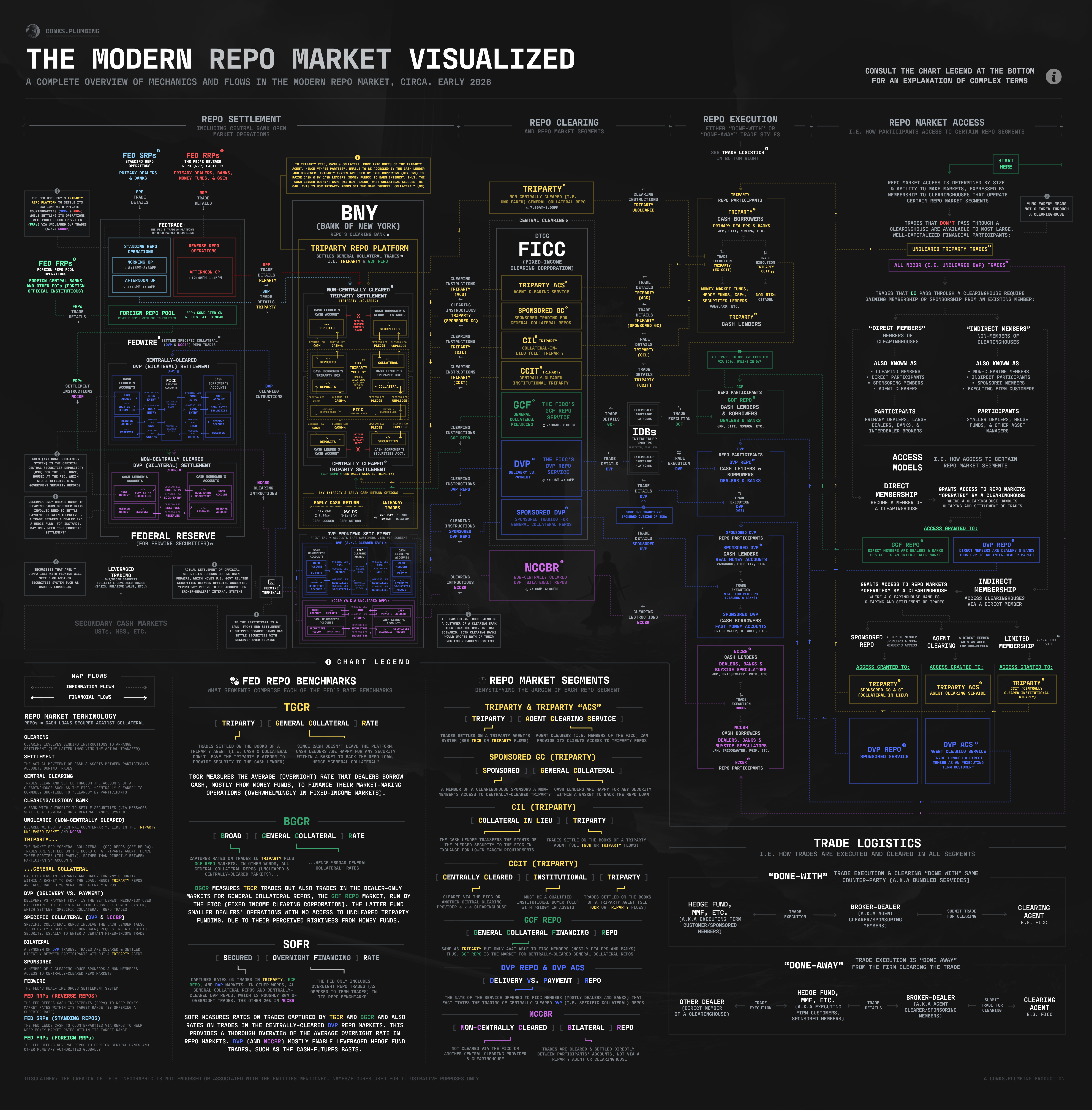
Infographics: The Modern Repo Market
an overview of modern repo market mechanics and flows (circa '26)

— created as part of The Fed’s New Target
A decent zoom feature will be required to navigate this extensive infographic, but the image viewer on Substack does not seem to be sufficient. Consequently, it’s recommended to download and view the graphic outside of the Substack website on a retina desktop or a high-quality tablet — such as in Apple Preview/Microsoft Photos. Flows start in the top-right (with the green “start here” box) and move from right to left. Plus, it’s best to read the chart legend to learn all the necessary lingo. The Fed’s New Target: Part II will provide more details soon. Enjoy!